Page Layout
Page Layout is a foundational component used to layout pages in an application with no side navigation. It is designed to be used in the content region of the Shell Layout component, but can be configured to work standalone.
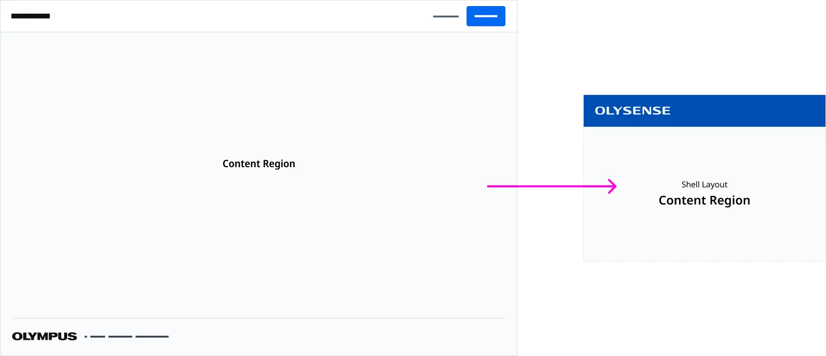
Anatomy
| Region Name | Slot | Description |
|---|---|---|
| Page Header Region | page-header | The slot used for page header content. |
| Page Footer Region | page-footer | The slot used for the page footer. |
| Content Region | (default) | The default slot used for content. |
Application Footer
An Application Footer is provided by detault. You can inject a customized Application Footer using the page-footer slot.
Associated Components
An Applicaiton Footer is a global component that is places at the bottom on an application.
Page Headers are used to render a page title and actions placed at the top of page.
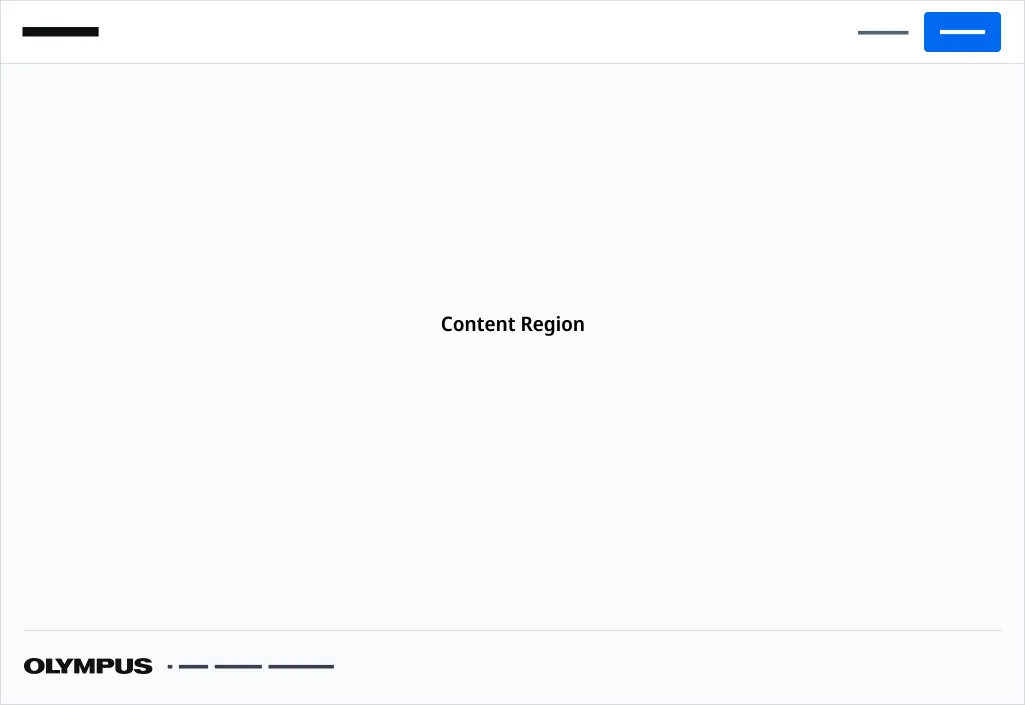
Parent Page Layout Examples
This parent type layout should be used as the starting page for an application that does not have side navigation.
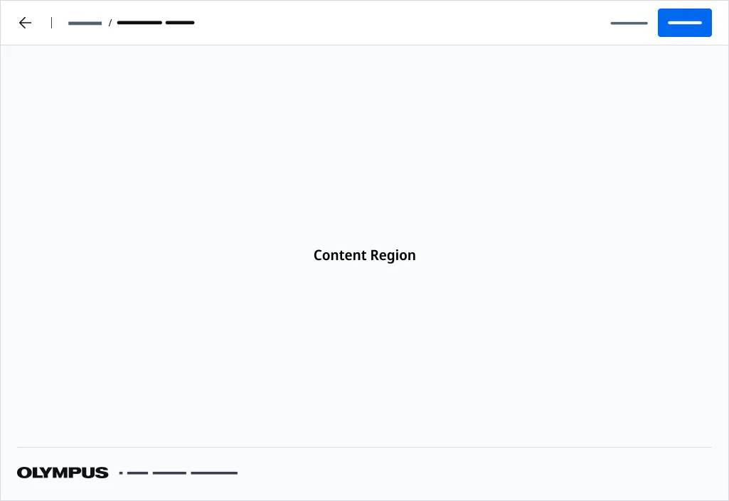
Child Page Layout Examples
Standard
The Standard layout should be used when you want to drill-down into content. This layout is paired with a Page Header with breadcrumbs and back navigation configured.
Patient Details, Procedure Report Previews and Entry Forms are good examples on content that should use a this type of layout.
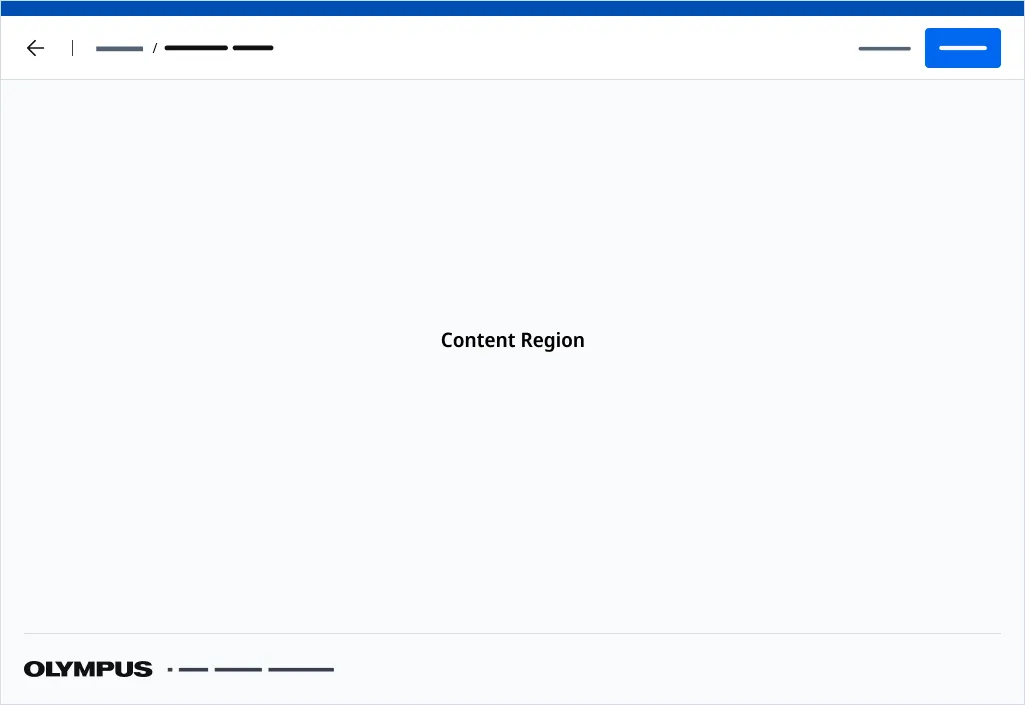
Full Screen Mode
Use fullscreen mode when you want to drill-down to content in a page and you would like the User to have complete focus on a task without distractions. Do note however, using fullscreen mode, will prevent the User from being able to access any funtionality in the OLYSENSE Application Bar.
Use the fullscreen attribute to render your page without a Application Bar. The page will be absolutely positioned above the all other content.
Standalone Mode
Use the standalone attribute when using the Page Layout component independently from Shell Layout.
Use the —offset-height CSS Variable to account for the height of any content placed above the page. By default, —offset-height is set to 64px to account for the Application Bar.
Importing
import '@ods/components/web.page-layout';Note: You only need to import a web component once in your code, as it registers itself globally when defined, allowing you to use it anywhere within your application without needing to re-import it each time you want to use the component.
This component is still in development and cannot be imported at this time.
Slots
| Name | Description |
|---|---|
| (default) | The default slot used for content. |
| page-header | The slot used for page header content. |
| page-footer | the slot used to insert an page footer component. |
Properties
Please note, both DOM properties and HTML attributes are shown in the table below. Unless otherwise specified, the property and attribute names are identical.
| Property/Attribute | Reflects | Type | Default |
|---|---|---|---|
outlines | boolean | false | |
standalone | boolean | false | |
fullscreen | boolean | false | |
copyrightText | string | '' |
Parts
| Name | Description |
|---|---|
| base | The component's base wrapper. |
Usage
Do
- Use the Page Header with Side Navigation with Parent Page Layouts.
- Use the Page Header with Breadcrumb variant with Child Page Layouts.
Dont
- Use the Page Header with Breadcrumb variant when building an application with no side navigation.
- Use side navigation within Child Pages.
- Use a Child Page Layout for the home page of your application.
- Use the back arrow in Page Header as a save function
- Drill down to a parent page from a child page.