Navigation Layout
Navigation Layout is a foundational component used to layout an application that has side navigation. It is designed to be used in the content region of the Shell Layout component, but can be configured to work standalone.
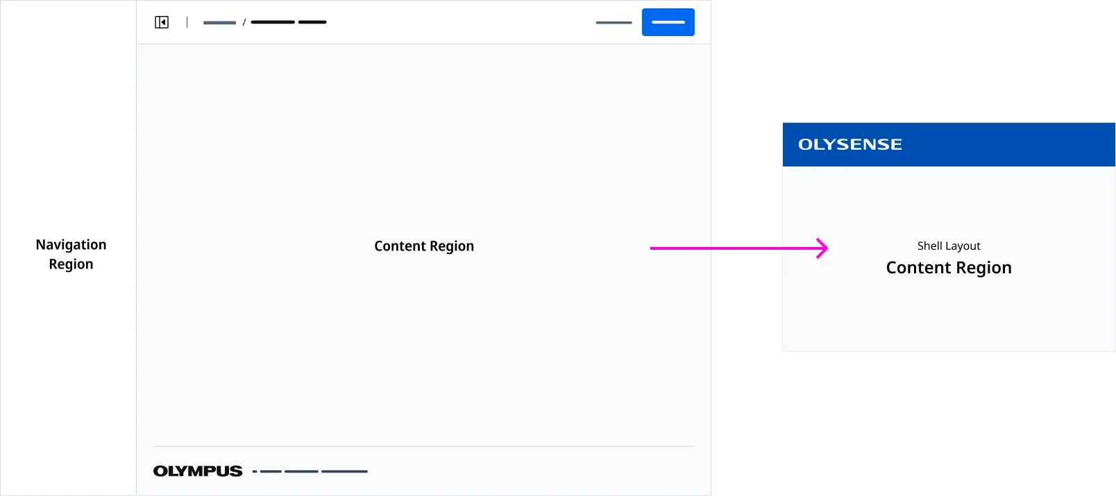
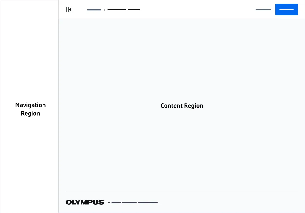
Anatomy
| Region Name | Slot | Description |
|---|---|---|
| Navigation Region | navigation | The slot used for the navigation content. |
| Page Header Region | page-header | The slot used for the page header. |
| Page Footer Region | page-footer | The slot used for the page footer. |
| Content Region | (default) | The default slot used for the application layout’s content. |
Page Header
A Page Header with the navigation button must be placed in the Page Header Region.
Application Footer
An Application Footer is provided by detault. You can inject a customized Application Footer using the page-footer slot.
Associated Components
Application Bars is a menu bar control that is placed at the top of an application. An Application Bar is always on top of body content except or Drawers and Modals.
Page Headers are used to render a page title and actions placed at the top of page.
Side Nav renders your applications main navigation.
Examples
Use the Navigation Layout component to build a page as the starting point for an application that contains side navigation.
Importing
import '@ods/components/web.navigation-layout';Note: You only need to import a web component once in your code, as it registers itself globally when defined, allowing you to use it anywhere within your application without needing to re-import it each time you want to use the component.
This component is still in development and cannot be imported at this time.
Slots
| Name | Description |
|---|---|
| (default) | The default slot used for content. |
| navigation | The slot used for the navigation content. |
| page-header | The slot used for the page header content. |
| page-footer | the slot used to insert an page footer component. |
Properties
Please note, both DOM properties and HTML attributes are shown in the table below. Unless otherwise specified, the property and attribute names are identical.
| Property/Attribute | Reflects | Type | Default |
|---|---|---|---|
outlines | boolean | false | |
standalone | boolean | false | |
copyrightText | string | '' |
Parts
| Name | Description |
|---|---|
| base | The component's base wrapper. |
Usage
Do
- Use for applications that have side navigation.
- Use a Side Nav component in the Navigation Region.
- Use Page Header with Side Navigation Icon variant.
- Use Page Layout to build child pages.
Dont
- Use a left aligned Drawer that conflicts with Side Navigaton.
- Use if your application DOES NOT have side navigation.
- Use the Navigation Layout component to build content in the Content Region
- Use the Shell Layout component to build content in the Content Region