Inline Panel Layout
Inline Panel Layout is a specialized layout component. It should be combined with the Inline Panel component for use cases that require a panel that can slide open and closed. An Inline Panel Layout should be used as a child page that was drilled-down to from Parent Page using Navigation or Page Layouts.
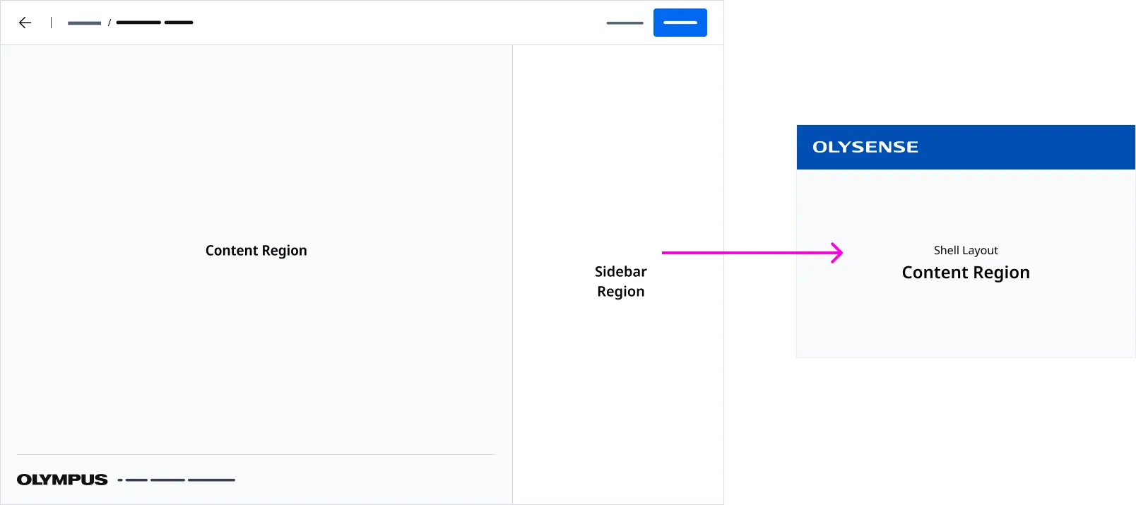
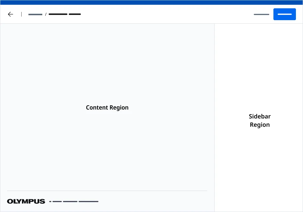
Anatomy
| Region Name | Slot | Description |
|---|---|---|
| Page Header Region | page-header | The slot used to insert a page header component. |
| Page Footer Region | page-footer | The slot used to insert a page footer component. Defaults to our Page Footer component. |
| Page Sidebar Region | page-sidebar | The slot used to insert a sidebar component. Inline Panel Layout supports the Inline Panel component only. |
| Content Region | (default) | The default slot used for content. |
Application Footer
An Application Footer is provided by detault. You can inject a customized Application Footer using the page-footer slot.
Associated Components
Page Headers are used to render a page title and actions placed at the top of page.
An Applicaiton Footer is a global component that is places at the bottom on an application.
Inline Panel is a collapsible component anchored to the right side of the page. It expands horizontally into view, pushing adjacent content over rather than overlaying it. When collapsed, the panel minimizes to a slim rail of buttons, preserving screen real estate.
Examples
Standard

Showing Inline Panel Layout paired with a Page Header with breadcrumbs and back navigation configured. Additionally, the Inline Panel component should be used within the Sidebar Region.
Full Screen Mode
Use fullscreen mode when you want to drill-down to content in a page and you would like the User to have complete focus on a task without distractions. Do note however, using fullscreen mode, will prevent the User from being able to access any funtionality in the OLYSENSE Application Bar.
Use the fullscreen attribute to render your page without a Application Bar. The page will be absolutely positioned above the all other content.
Standalone Mode
Use the standalone attribute when using the Page Layout component independently from Shell Layout.
When in standlone mode, you will have to adjust the offset height of the layout and the inline panel.
- Use the —offset-height CSS Variable to account for the height of any content placed above the page. By default, —offset-height is set to 64px to account for the Application Bar.
- Use the —inline-panel-offset-height CSS Variable to account for the height of any content placed above the page that impacts the height of the inline panel regions. By default, —inline-panel-offset-height is set to 64px.
Importing
import '@ods/components/web.inline-panel-layout';Note: You only need to import a web component once in your code, as it registers itself globally when defined, allowing you to use it anywhere within your application without needing to re-import it each time you want to use the component.
This component is still in development and cannot be imported at this time.
Slots
| Name | Description |
|---|---|
| page-header | The slot used to insert a page header component. |
| page-footer | The slot used to insert a page footer component. Defaults to our Page Footer component. |
| page-sidebar | The slot used to insert a sidebar component. Inline Panel Layout supports the Inline Panel component only. |
| (default) | The default slot used for content. |
Properties
Please note, both DOM properties and HTML attributes are shown in the table below. Unless otherwise specified, the property and attribute names are identical.
| Property/Attribute | Reflects | Type | Default |
|---|---|---|---|
outlines | boolean | false | |
standalone | boolean | false | |
fullscreen | boolean | false | |
showInlinePanel | boolean | true | |
copyrightText | string | '' |
Parts
| Name | Description |
|---|---|
| base | The component's base wrapper. |
Usage
Do
- Use the Page Header component with the Page Header Region.
- Use the Inline Panel component with Sidebar Region.
Dont
- Use the Page Header with Side Navigation variant.
- Use the Page Header with Actions variant.
- Use any other component in the Sidebar regions besides Inline Panel.
- Drill down to a Naviation Layout from a Inline Panel Layout.
- Drill down to a Shell Layout from a Inline Panel Layout.