Color System
Color is a fundamental part of the OLYSENSE Design Systems’ (ODS) visual language. In this guide you will learn about the principles, patterns, and abstractions that make up the ODS color system.
Overview
Color Modes in Figma
When designing product interfaces in Figma, we recommend using light mode or dark mode as the ODS Components Figma library provides components and tokens in those two modes.
Color Design Tokens
The OLYSENSE Design System (ODS) delivers colors in the form of design tokens. Design tokens are a layer of abstraction that allows for better maintainability, consistency and theming. Within ODS, design tokens are represented as CSS variables for code and Figma variables for design. For a full reference table of all available design tokens, see Design Tokens.
As an example of how color tokens work, when —ods-sys-color-surface-base is used, the value of that token will automatically change depending on the color mode.
Design Token Categories
OLYSENSE Design System color tokens are categorized into three levels:
- Reference
- System
- Component
To read more about the naming convention, see the design token naming documentation.
About Color Roles
Reference Color Tokens
Reference color tokens are the lowest level tokens and map directly to a raw value. They are only to be used as a reference for System and Component tokens. Reference color tokens don’t respect color modes and should never be used directly in code or design.

System Color Tokens
System color tokens represent the decisions and roles that give the design system its character, from color and typography, to elevation and shape. These are the most commonly used design tokens applied throughout all of the OLYSENSE Design System. System color tokens point to Reference color tokens under the hood, and respect color modes.

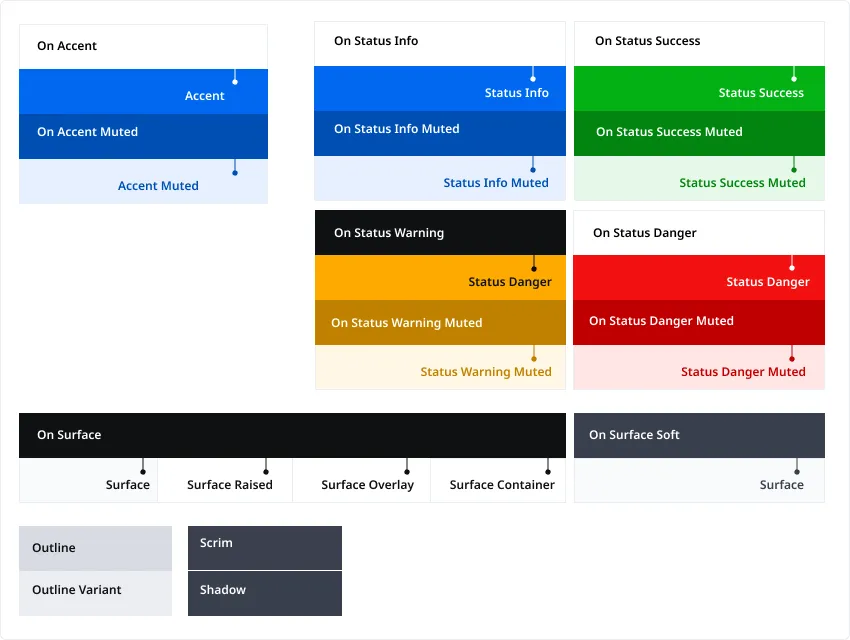
Surface
Surface colors are used for backgrounds and large, low-emphasis areas of the screen. Surface tokens are. combined with On token pairings for text and icons.
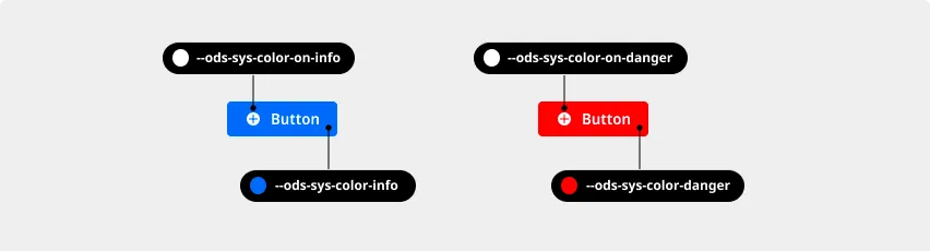
Accent and Status
Accent and Status colors provide a stronger emphasis for UI elements and are always combined with On token pairings for text and icons.
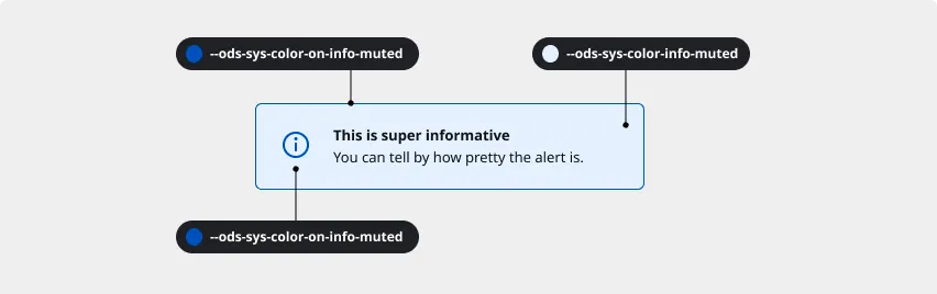
Muted
Muted background and border colors are often combined to draw attention to a specific piece of content with a subtle emphasis. They are paired with their On token equivalents.
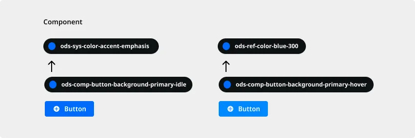
Component Tokens
Component tokens are used for values that are more specific or unique than System tokens. These tokens are limited and System tokens are preferred. Component color tokens may reference both System and Reference tokens under the hood, and respect color modes.
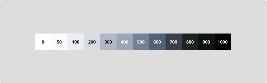
Neutral Colors
The OLYSENSE Design System’s Neutral scale offers shades of gray. Steps 0 is pure white and 1000 is pure black.
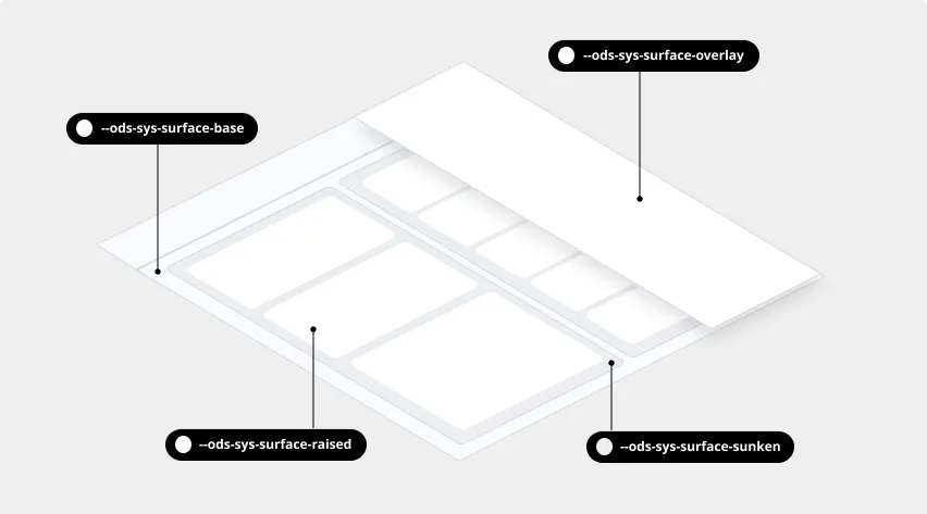
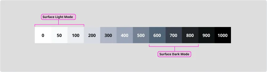
Surface
Steps 0 through 100 are typically used for surface colors in light mode and 600 through 800 in dark mode. In light mode, step 50 is used for surface-base, 0 for surface-raised, 100 for surface-sunken. In dark mode, step 800 is used for surface-base, 700 for surface-raised, 600 for surface-sunken.
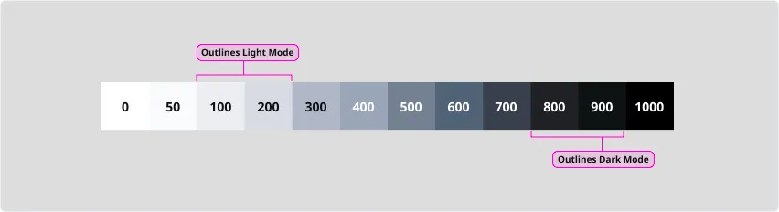
Outlines
In light mode, steps 100 and 200 are typically used for borders and dividers. Step 200 is considered the minimum contrast value for interactive control borders against surface-base. In dark mode, steps 800 and 900 are typically used.
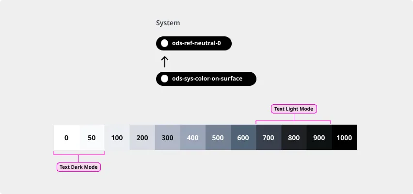
Text and Icons
In light mode, steps 700 through 900 are used for text and icons. In dark mode, steps 0 and 50 are used.