Buttons are used for interface actions. Primary style should be used only once per section for main call-to-action, while other styles can appear more frequently.
Use the default state of the button along with the caret attribute to add a dropdown indicator when a button will trigger a dropdown, menu, or popover. You can see a fully functional dropdown component here .
Note: You only need to import a web component once in your code, as it registers itself globally when defined, allowing you to use it anywhere within your application without needing to re-import it each time you want to use the component.
This component is still in development and cannot be imported at this time.
Slots
Name
Description
(default)
The button's label.
prefix
A presentational prefix icon or similar element.
suffix
A presentational suffix icon or similar element.
Properties
Please note, both DOM properties and HTML attributes are shown in the table below. Unless otherwise specified, the property and attribute names are identical.
Emitted when the form control has been checked for validity and its constraints aren't satisfied.
--
Methods
Name
Description
Arguments
click()
Simulates a click on the button.
--
focus()
Sets focus on the button.
--
blur()
Removes focus from the button.
--
checkValidity()
Checks for validity but does not show a validation message. Returns `true` when valid and `false` when invalid.
--
getForm()
Gets the associated form, if one exists.
--
reportValidity()
Checks for validity and shows the browser's validation message if the control is invalid.
--
setCustomValidity()
Sets a custom validation message. Pass an empty string to restore validity.
--
Parts
Name
Description
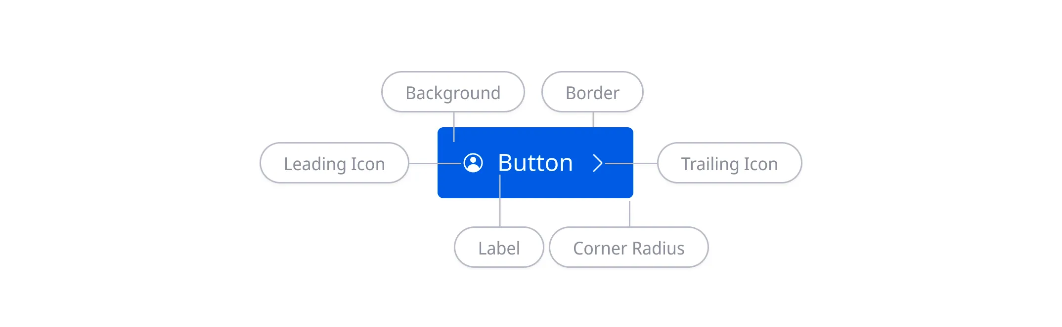
base
The component's base wrapper.
prefix
The container that wraps the prefix.
label
The button's label.
suffix
The container that wraps the suffix.
caret
The button's caret icon, an `<ods-icon>` element.
Dependencies
This component automatically imports the following dependencies.
ods-icon
Design
Anatomy
Accessibility
To ensure buttons are visually accessible, any button text must pass 4.5:1 and icons must pass 3:1 contrast against their background in all interactive states. As long as text and icons within buttons meet the contrast requirement, there’s no contrast requirement for the button stroke.
Disabled buttons aren’t interactive and don’t need to pass color contrast.